Total Amount
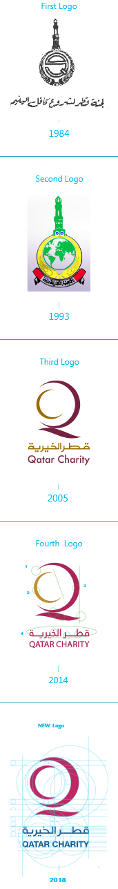
Qatar Charity Logo
The originality and creativity came together in the logo of Qatar Charity, reflecting the values and principles of the Qatari society in an innovative visual way, through the two halves of the two circles, one of which contains the other at the top of the logo. Each half of both circles represent the first two letters of "Qatar Charity" in the English language, i.e. (Q) from (Qatar) and (C) from (Charity).
The upper circular part also represents the globe, in which we all live. Below the globe, there is a curved line resembling a caring hand that seeks to provide protection and care for all humanity. This is what reflects the humanitarian principles adopted by Qatar Charity to support those in need anywhere and bring a dignified life for everyone.
Please Read The Digital Brand Usage Policy Download logo

#BB1D64

#074C82

#54575C

#899492

#4AC8BC

#40ACC8

#FD6174


Several changes were made to Qatar Charity’s logo throughout different periods. It had previously some details with one color, and then it became a three-colored one. Finally, the logo adopts the latest trends in visual image design by reducing details and colors to look simple, powerful, and clear.
Shed a light into my Life!
Please consider making a higher monthly donation to help with other living necessities
1
2
3
4
Choose donation amount
Total Amount